coterie creative co.

Filtering by Tag: Domain7

Share

Learning from the Masters: Real life UX lessons from Magritte and Van Gogh

Added on by Amanda Lee Smith.

We went to Europe! And somehow, immersed in the works of the Continent's greatest artists, away from data roaming, I still managed to have my mind on the web... I recently shared some thoughts on the Domain7 blog.

I’m a sucker for modern art and, for me, no travels are complete without spying a local collection of 19th and 20th century greats. A recent visit to Brussels and Amsterdam offered a deep dive into two of my favourites: Magritte and Van Gogh, respectively.

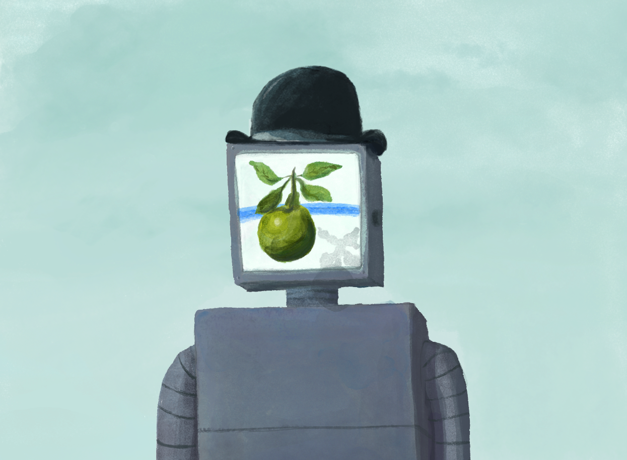
Truth be told, I favour Magritte with his hyperreal detail and his way of challenging our perceptions of reality with accessible wit. I had the museum mostly to myself, and I had splurged on an audioguide. It was a diverse and interesting collection…. and yet I couldn’t wait to get out.

The experience was jarring and unmetered—and it was nothing I could blame on Surrealism.

Its shortcomings were only further illuminated when I visited Amsterdam’s Van Gogh Museum a few days later. It was packed, and yet, like everything in Amsterdam, the crowd followed an invisible but understood rhythm—a natural flow. I absorbed more; I didn’t feel like I was constantly backtracking or missing key pieces; I didn’t feel overwhelmed or impatient.

This is user experience design.

As I considered what made Van Gogh a delightful seamless experience, and what made Magritte frustrating and disorienting, I realized these museums offered valuable lessons we can apply to digital experiences:

1/ KNOW YOUR USERS

Brussels and Amsterdam are both international cities where English is the lingua franca. Where Van Gogh caters to the English majority, putting greater emphasis on English wall text and labels than Dutch, large swaths of display text at Magritte are only in French and Dutch. Know your audience and understand their needs—don’t cater to a niche at the risk of alienating a majority.

2/ SIMPLIFY

Magritte’s curators bog visitors down with detailed biographical timelines—elaborate histories that force art lovers to loiter and jockey for a view of tiny text. Van Gogh’s pull out the relevant highlights, making them bold, concise and visual, so you never need to linger in one place reading too long. Focus on the essentials. If there’s one thing you want users to do or know, don’t let them get sidetracked by superfluous details.

3/ REDUCE BARRIERS

At Van Gogh, floors are organized by theme, rather than chronology, so you can visit them in any order, to avoid traffic-heavy areas. Smart. Magritte’s prescribed chronology directs visitors through dark rooms where paintings are set against striking black walls and illuminated by megawatt lights. While it evokes the same sense of drama inherent in Magritte’s paintings, the reflected light makes it impossible to view paintings face-on—forcing visitors to stand at an angle. You never know how users will access your site. Reduce barriers at every potential entry point. Chances are they’ve come to do one thing—make it as easy as possible.

4/ GROUP LIKE-OBJECTS

Both museums feature works by other artists who either inspired, or were inspired by the museum’s namesake. Magritte’s curators intersperse these with his own works. The styles may be complementary, but they are clearly different, which is confusing until you read the label. Van Gogh’s curators, by contrast, devote specific rooms to works inspired by the artist. Consider where users expect to find things. Don’t subvert their expectations. This often means grouping like-objects together in ways that are easier for our brains to understand, according to the Gestalt principles

5/ BE TRANSPARENT

In a room devoted to his process, the Van Gogh Museum gives a glimpse at the tools and techniques the artist used: infrared technology reveals how he repurposed canvases and used perspective frames to capture depth and proportion. Don’t rely on smoke and mirrors. The best web experiences are often the most transparent.

6/ BE AUTHENTIC

A bonus lesson from the artists themselves: both Van Gogh and Magritte are famous for their prolific self portraiture. They didn’t hide behind technique or preserve enigmatic status—they put their authentic selves on display. As should you.

originally published on Domain7.com

Share

5 Characteristics of Great Content Marketing

Added on by Amanda Lee Smith.

Recent writing, originally posted on Domain7.com. Illustration by Will Mullery:

Several years ago, in dark and dire economic times, I landed a job keyword-stuffing at a dubious SEO firm in Toronto. They made big promises about Google pagerank and lectured clients about cultivating inbound links once their static template sites were live.

There was nary a mention of blogging, and if it did come up, the principal would warn the client against the time and energy of upkeep—“better to invest in keyword optimized web pages and inbound links.”

Thank heavens those days are over. Marketers have learned they can’t outsmart Google, and have wisely shifted their focus to giving customers great, relevant content designed to keep them coming back.

By now, every company worth their salt is on board the publishing train. Whether you call it brand publishing, content marketing, plain old blogging, it’s the new baseline measure. But that doesn’t mean everyone does it well.

As a reader, writer and publisher working in marketing. I’ve made it my mission to wade through the pap and root out the truly delightful—excellent journalism, thoughtful curation or clever community-building that doubles as advertising. It turns up in some unexpected places.

I’ve discovered, there are 5 things great content marketers have in common:

1/ TRANSPARENCY

Your goal as a content marketer is to build a lasting relationship with your consumer, and the best relationships are built on trust. Many companies have existed for years as a closed company and now technology and consumer expectations are calling them to be more open. Like a first therapy session, opening up can be terrifying, but transparency forges a bond. That might mean giving customers a peek into your operations, or publicly acknowledging and accepting responsibility for a corporate foible. It might be as simple as describing your process or introducing your CEO.
Nailing itEverlane. The online retailer sells high quality clothes at affordable prices, and tells consumers exactly how they do it. Those savings don’t come at the cost of factory conditions. But rather than just saying so, Everlane shares stories and photos of every single garment factory they use.

2/ BRAND VALUES ARE ALIGNED

Maybe the only thing worse than veiling your company process and culture is insincerity. The story you tell needs to align with your real life values. Two very different brands come to mind. Neither are particularly sexy, and both wanted to reach a younger, hipper market. Fried chicken giant, Chic-fil-a, recently launched an online lifestyle magazine, called Let’s Gather. At first glance it looks like a Kinfolk magazine parody: heritage-inspired, over the top sincerity that encourages readers to go a year without groceries, or to fill their diet with superfoods. But you won’t find any salmon, kale or chia seeds on the menu at Chic-fil-a, and fast food has no connection with a waste-free lifestyle.

By contrast, Ziploc embraces their position as a functional, crafty and budget-friendly product, and teamed up with popular crafty young blogger, Joanna Hawley. She took over the Ziploc Holiday blog, posting just the sort of baking and decor ideas that will resonate with Ziploc fans, occasionally incorporating Ziploc products. Great content marketers don’t try to be something they’re not or latch on to a brand direction just because it’s cool or of the moment.
Nailing itArcteryx. The outdoor apparel company’s moody evocative online magazine Lithographica not only offers behind the scenes glimpses into process and production, it shares beautiful adventure photography, reviews of relevant titles, and thoughtful writing, all in sync with the company’s ethos.

3/ COMMUNITY ENGAGEMENT

Whether it’s engaging their fans to produce original content, curating it from customer feeds, or featuring real users, the best content marketers keep their community front and centre. They invite engagement and source content from an existing user base. Portland-based outdoor gear company Poler Stuff has capitalized on their dedicated community—replacing catalog shoots with adventure documentation, and pulling from their seemingly endless user contributions, collating them under the #campvibes hashtag—appropriated as their own. They’ve even recently parleyed that content into a sold-out print magazine
Nailing it: Visual Supply Co. This photo-editing-software-turned-popular-mobile-app is famous for their curated Grid of user photos. They also feature in-depth profiles of the fascinating creatives who already use and love VSCO products. Taking it a step further, they recently introduced a million-dollar scholarship fund to support their artists. All recipients need to do is document their progress on the VSCO Grid. 

4/ CONTENT SO GOOD YOU’D PAY FOR IT

Excellent writing and beautiful imagery will always find an audience. But here’s the thing: great content isn’t cheap. The best content marketers invest resources and time into their content and don’t cut corners on quality. Thanks to the wonders of analytics, you can treat it as a revenue centre, and track the impact on your bottom line. In fact if content is good enough, consumers will pay for it. Swedish clothing brand Acne captured this early on with their large format print journal Acne Paper—a publication so lovely I’ll gladly shell out $20 for it.
Nailing itRandom House Canada. The book publisher’s Hazlitt blog is a trove of quality reading material for lit geeks, often supplied by notable name Random House authors. Aimed at a smart, edgy customer, it’s packed with original short fiction, snarky advice, and cheeky social commentary. It’s Vice for people who read. just really smart, thoughtful content. Oh, and a line of Hazlitt Original ebooks, available for $2.99. 

5/ USEFUL OR INTERESTING ENOUGH TO SHARE

Theres a level of altruism in great content marketing. It’s not just reaching out to pull you in; it leaves behind a gift—fills a gap in your skills or knowledge, fuels dinner table conversation, inspires you, or engages your curiosity. Great brand publishers never leave a reader thinking “so what?” And if a reader can answer that question, they’re very likely to pass that gift along.
Nailing it: West Elm. I already love this clean simple home line, but when they gave me cute desktop wallpapers and taught me how to make my own sourdough starter and to fold a fitted sheet, I loved them even more.